
... ganz gerne mal die Komfortzone, insbesondere bei Farben.
... the comfort zone, especially when it comes to colors.
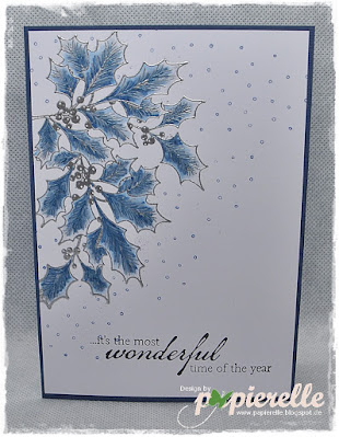
Also, warum nicht die Stechpalmenzweige mal in blau colorieren?
So why not color the holly branches in blue?
Zuerst habe ich die Zweige silbern embossed und dann mit Alkoholstiften coloriert.
Dazu gab es noch ein paar blaue Schneeflocken und einen passenden Text.
First I embossed the branches in silver and then colored them with alcohol pencils.
There were also a few blue snowflakes and a matching sentiment.
~~~~~~~~~~~~~~~~~~~~~~~~~~~~~~~~~~~~~~~~~

~~~~~~~~~~~~~~~~~~~~~~~~~~~~~~~~~~~~~~~~~
Komfortable Grüße aus dem Wald
Eure

31 Kommentare:
It is always interesting to get out of the comfort zone. You've got a great card, Gundi.
Hugs from Spain
Guten Morgen liebe Gundi,
diese Karte sieht aus wie von der Eisprinzessin gemacht *lächel* ... ich liebe diese Farben für den Winter sehr!
Ich wünsche Dir einen guten Start in die neue Woche!
♥️ Allerliebste Grüße , Claudia ♥️ .. die heute morgen aussieht, wie das kleine Vögelchen am Ende ....
Hallo Gundi,
ich bin zwar gerne der komfortable Typ, aber in diesem Fall gehe ich sehr gerne mit Dir. Deine Karte ist einfach wunderschön - gesehen und verliebt!
Viele Grüße und einen guten Start in die neue Woche!
Wow, absolutely wonderful, I totally love it.
Crafty hugs xx
Ich liebe es! Ich liebe Blau, so Ich mag deine Idee... sehr shön!!
XX
Ich finde, alles was gefällt ist auch erlaubt! Und wenn man sich in den Deko-Läden umschaut: da gibt es pink-glitzernde Rentiere usw. - also was ist dagegen 'ne blaue Stechpalme?? :-)
Liebe Grüße
Anke
Ton in Ton sieht doch schön aus, du hast die Karte wunderbar gestaltet, sie wirkt so kühl und daher passend zum Winter.
Liebe Grüße Erna
Why not colour the pretty holly in blue?....A really beautiful card x. Unconventional and I love it!....x.
Deine Titelzeilen lassen meinen Atem stocken, doch wenn ich dann den Text lese, ist alles gut.
Ja, ich mache auch gerne mal Spielereien mit den Farben. Immer nur so wie es sein soll/te, ist langweilig. Und: warum sollen Stechpalmenzweige nicht mal blau erscheinen - wenn das entsprechende Licht darauf fällt!!!
LG Flo
Es muss ja nicht immer weihnachtlich rot-grün sein, diese kühle Farbkombi paßt doch wunderbar in die Jahreszeit.
Gruß Linda
Ein schönes Werk ist dir gelungen. Ich finde, die Farben passen perfekt.
LG Ilse (thera)
The holly branches in blue is a great idea, Gundi. Lovely card. I love not using the traditional colors too! Hugs, my friend.
I am loving the blues in your holly branch, so festive with a touch of silver.
Warum nicht mal blau liebe Gundi,
die Farbe schaut mit Weiß und Grau edel aus.
Dir einen schönen Abend, lieben Gruß
Nicole
Wunderschön, strahlt eine friedliche Stimmung aus irgendwie.
LG
Ela
WOW this is gorgeous, I LOVE the blue holly, very beautiful card!
Hugs, Tammy
love the idea of blue holly leaves - wonderful card!
Your blue holly branch is a stunner, one of my favorite colours. Thanks for joining us at CAS Christmas :)
Blue is my favourite colour, so makes sense to me to colour the holly blue. Beautiful colouring and a great corner design. Thank you for joining us at CAS Christmas.
Your blue leaves are just lovely with the touch of silver! Why indeed not colour them blue - if I were outside for any length of time this morning, I'd be turning blue too!
Ich finde deine Farbwahl wunderschön.
GLG Sigrid
P.S. I love your little graphic - about sums up my Monday mornings too!
Beautiful and so striking x
Ich liebe deine blaue Variante! Wunderschön! Liebe Grüße Christin
Hübsche Karte, perfekt für Herbst/Winter. LG Romy
Why not indeed, especially when it turns out like this. I love it, love the festive header too xx
Your blue holly is absolutely gorgeous and I love your CAS design on this card! Thanks so much for playing along with us at CAS Christmas!
Wunderschön winterlich, und mit dem Silber und Blau wirkt sie auch noch recht edel! Der Spruch passt perfekt!
You can never go wrong with blue & silver in my book! This is gorgeous!
Beautiful, Gundi ... a delicious, unconventional colour palette that you've made work wonderfully ... I do love blue and silver together! Hugs, Anita :)
Zauberhaft und edel, was will man mehr. Supertoll!
GLG Claudia
Kommentar veröffentlichen